Project Prompt:
Design an app for a public art museum to advertise exhibitions and events, provide information to patrons, and enable patrons to schedule visits.
Role
Lead UX Designer
Duration
6 months
Tools
Figma
Adobe Photoshop
Canva
Design Process
Discovery
Ideation
Design
Usability Testing
1
Discovery
2
Ideation & Design
3
Usability Testing
4
Reflection
Discovery
User Research: Summary
To gain more insight into what patrons wanted, I surveyed patrons of the museum. Since visitation was low, I also surveyed non-patrons who were in the museum’s target demographic.
I learned that both groups had a common desire: they all liked the idea of going to a museum, but didn’t want to have to jump through hoops to get information about events or schedule out visits. They wanted the information to be accessible and readily available with minimal research on their part.
User Research: Pain Points
1
Difficult to Schedule
Users were unsure of how to schedule a visit at the museum. They were also unsure if they had the option to visit the museum spontaneously without an appointment.
2
No Advertising
Users were unaware of upcoming exhibitions and events, as information about these items was not advertised online.
3
Inaccurate Information
The museum’s hours were not listed properly online, so users were unsure when the museum was open.
4
Lack of Community Connection
Most of the users knew of the museum, but didn’t feel a connection. Users didn’t feel motivated to go to the museum.
Persona: Carol
Problem statement:
Carol is a retiree who needs to sign up for a local adult painting class because she wants to get more involved in the arts and learn new skills/hobbies in a setting that is appropriate for her age.
User Journey Map
I created a user journey map of Carol’s experience using the website to help identify possible pain points and improvement opportunities.
Pain Points: Website organization, lack of relevant information, difficulty using buttons and reading text
Ideation & Design
Sitemap
Confusing web navigation was a large pain point for users, so I used their feedback to create a sitemap. My goal was to restructure the current information architecture to improve overall navigation and user experience. I chose a simplified structure and design in order to cater to all audiences.
Paper Wireframes
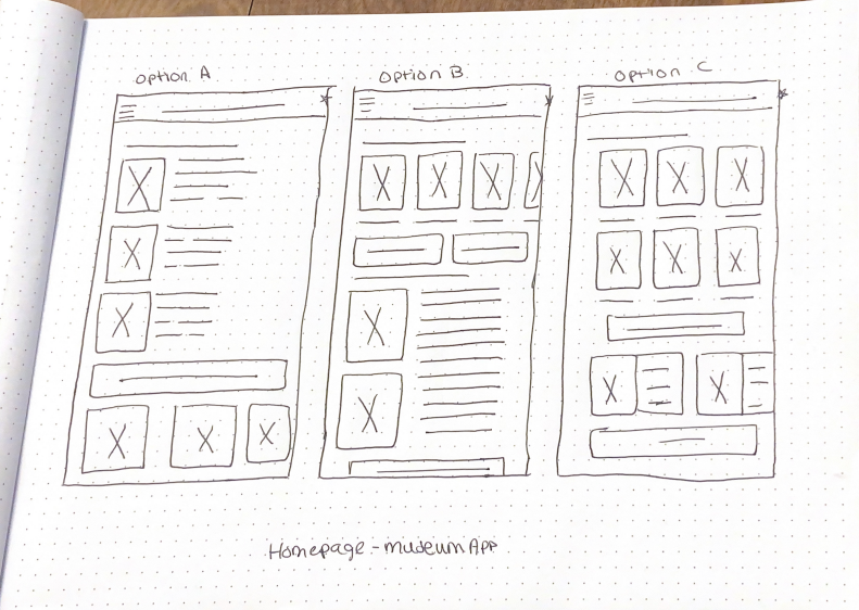
I began sketching out paper wireframes for the homepage of the app. I focused on relevant information, browsing, and user flow while brainstorming designs.
The homepage paper wireframes focus on highlighting important information and optimizing browsing for users.
Digital Wireframes
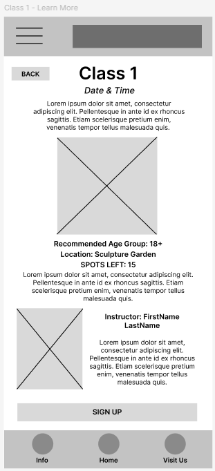
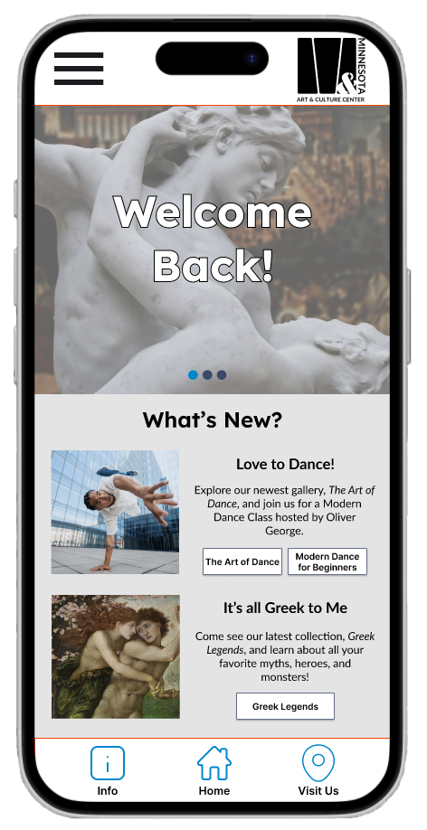
Transitioning from paper wireframes to digital helped me bring my vision to life. I was able to better understand and address user pain points to improve the user experience.
My top priorities were creating useful buttons and quick glance previews, as well as ensuring my homepage was clean and legible.
Usability Testing
Parameters
Study Type:
Moderated Usability Study
Location:
St. Paul, Minnesota, United States
Participants:
5 Total Participants
Length:
20-30 Minutes
Findings
Round 1 Findings:
Users struggled to book tours, desired calendar option over scrolling.
1
Users questioned whether they were in “The right spot”.
2
Users were easily distracted by images or words that were unrelated to their tasks.
3
Round 2 Findings:
Users were able to move through quick path in much less time (average under 30 seconds).
1
Users liked repetitive actions that appeared throughout app.
2
Users desired a quicker advancement through tasks like booking tours or classes
3
Reflection
Takeaways
Impact:
Our target users shared that the new app design was easier to navigate through, with more intuitive flow and helpful icons/buttons. They also noted that the images and brief descriptions were engaging, and the layout of text demonstrated a clear visual hierarchy.
What I learned:
I learned that sometimes, more is not better. In the beginning, my users were overwhelmed by the number of options they had on the homepage. By focusing on important items, I was able to help users navigate easier through the app. My most important takeaway was to listen to my users and focus on their needs over the aesthetic of the app.
Next Steps
Run usability test with final product
Expand mobile app by adding interactive website
Expand wireframes to include search capabilities on mobile platforms


